Food & Drink Packaging Photography for 4 Aces
4 Aces are one of the UK’s leading providers of disposable packaging for the food and beverages industry. Their paper and PET cups, disposable tableware and biodegradable food containers can be found at water coolers, vending machines, snack bars and coffee shops the length and breadth of the country.
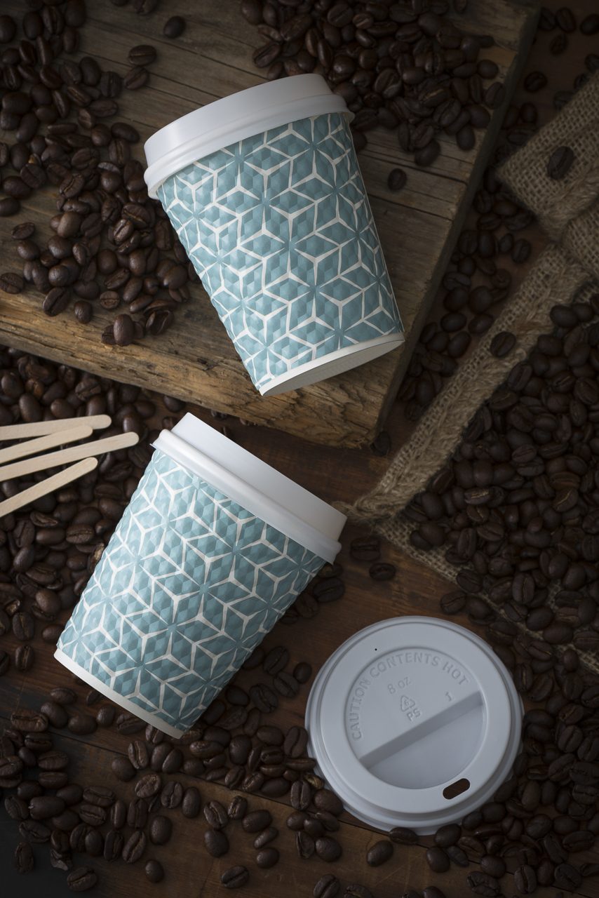
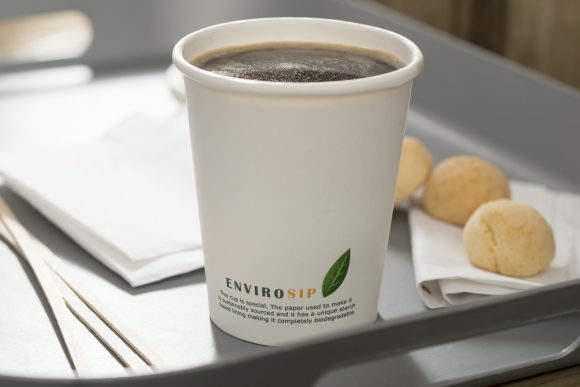
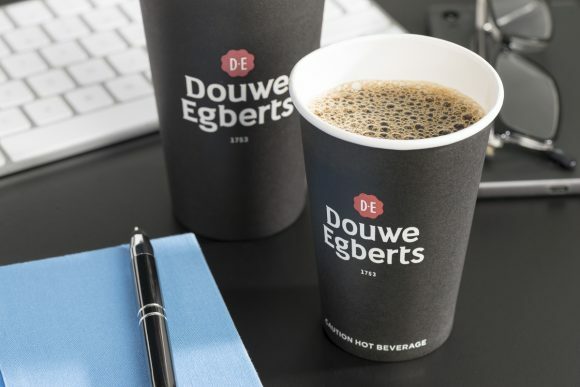
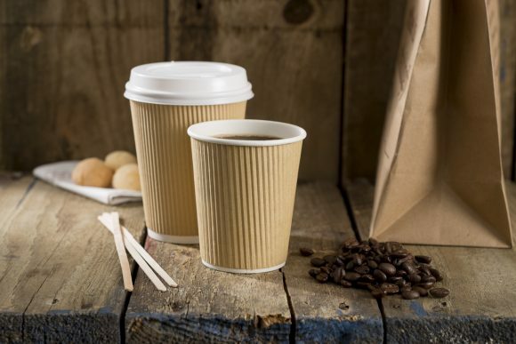
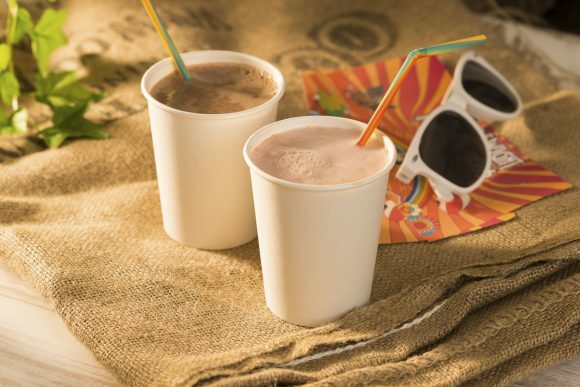
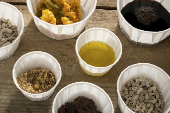
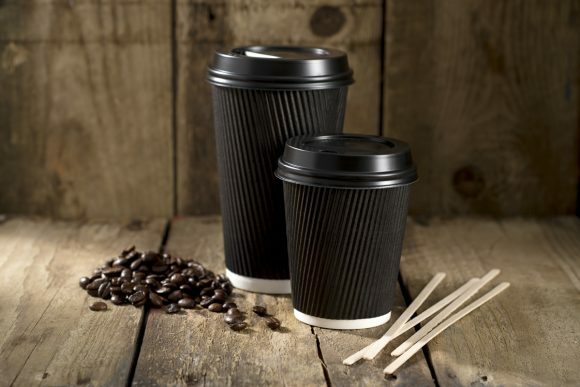
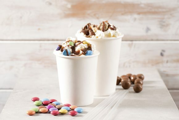
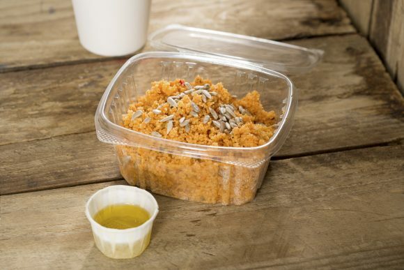
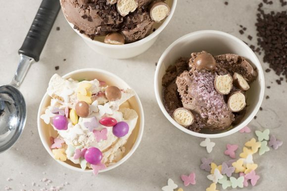
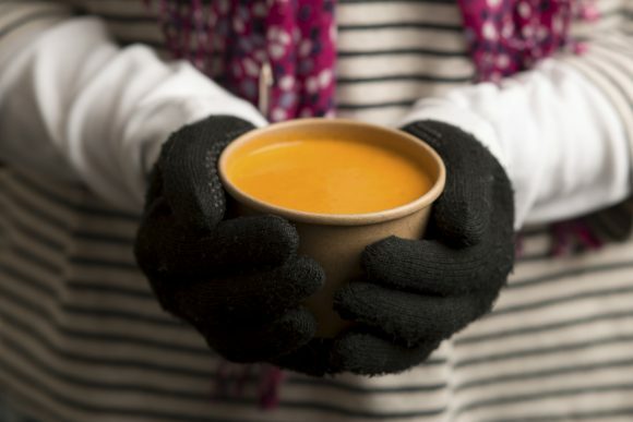
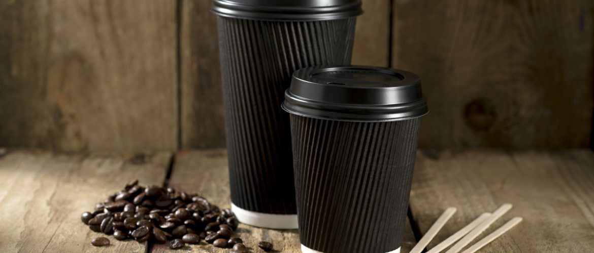
The team over at 4Aces commissioned Photography Firm to produce a large image bank of lifestyle product photography, showcasing several ranges of their most popular items in situ. The idea being to bring these otherwise somewhat mundane objects to life by showing them in the environments where they are most commonly used.
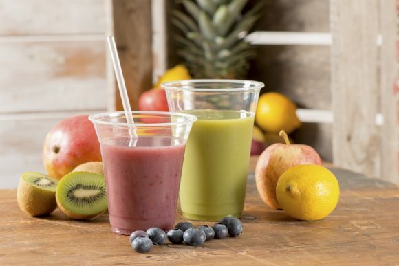
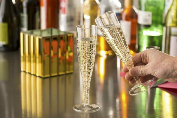
The scenarios we needed to cover were a trendy bar, office, festival, picnic, cafe, smoothie bar, and warehouse. However, not only would it have been a major task to secure real-life locations for each of these situations, but the time required to setup, shoot and move between them would have proved prohibitively expensive. As would all the separate location fees.
The solution we proposed was to recreate each environment in the studio, building small sets which were then dressed with appropriate props and plenty of fresh ingredients to bring them to life. This way we were able to show off 4Aces’ products in a controlled – but nonetheless quite believable – environment.
Shooting on location can of course add a certain degree of authenticity to photographs. However, beyond cost, the downside is that locations frequently turn out to be somewhat inconvenient, especially with regards to setting up photographic lighting. They also inevitably entail some creative compromise, as of course the perfect location rarely exists in the real world exactly as in our imaginations. Instead, by custom-building sets in the studio we were able to decide exactly what was or was not included in the shots, guaranteeing that they were free from any unwanted elements or visual distractions and that each product could be lit in the most appropriate and stylish way.We went for tight cropping and composition across the series of photos. This was for two reasons: firstly it helped to clearly foreground and display 4Aces’ products at their best; but secondly it reduced the need to build overly large sets or source extra props, furniture and other items that would have upped costs. As the products were all quite muted in tone, we opted to use lots of brightly coloured props, thereby adding a little more vibrancy to the scenes.
All in all this was a fun shoot to do, and we really enjoyed the creative challenge of injecting some style and vitality into what are ultimately, of course, not the sexiest of products.
And this is a very important point: just because your products are not especially glamorous or exciting doesn’t mean that the way you market and position those products should be equally dull. With a little creative use of photography and set-design, even the most mundane and practical of items can be given a new lease of life – adding a lot more visual appeal to your website and setting you apart from competitors.
Similarly, whether you’re a photographer or marketeer, don’t drop your creative standards merely because the product is not particularly stimulating. Where’s the challenge in taking a beautiful photo of an already stunning fashion model anyway? What about turning an ordinary, everyday paper cup into the center of attention? Surely that’s more of an achievement?
Well, funnily enough, even paper cups can make for cover stars: the final shot being featured on the front page of Vending International magazine!
