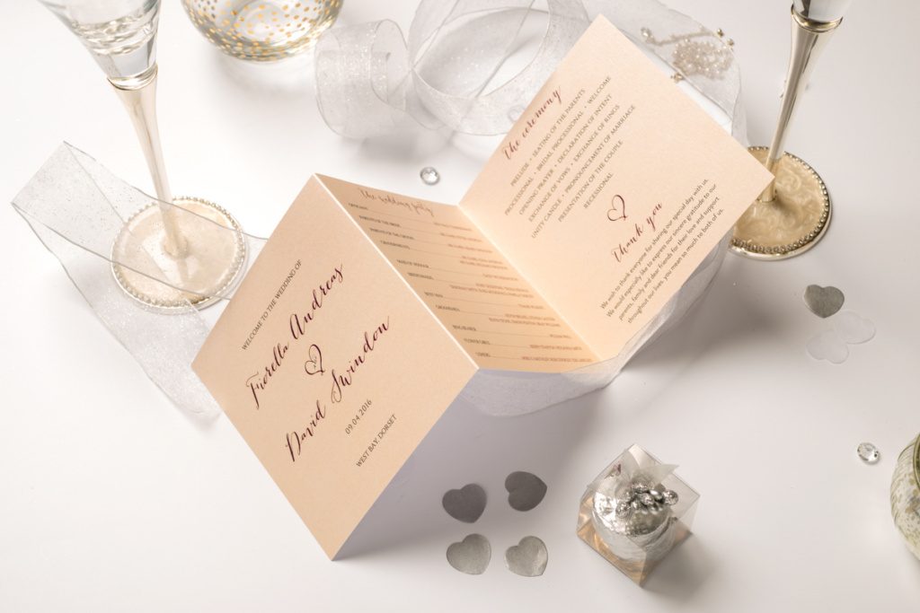
In an increasingly virtual world where Facebook LIKES and group invites might have replaced a good deal of one-on-one sentiment, it seems we’re still drawn to the gloriously tactile, especially personal experience afforded us by gorgeous stationery. Whether it’s scribbling our thoughts in a favourite bound diary or receiving an invitation on beautifully gilded card, there’s something inherently satisfying about stationery, and its popularity on thriving e commerce site NOTHS (Notonthehighstreet.com) is testament. NOTHS encourage styled photography with a predominantly contemporary, bright, naturally soft aesthetic consistent across their pages. They’re extremely particular about the sellers and the professionalism of the imagery they host, understanding as we do how vital quality photography is in boosting customer interest and product sales.
All product photography requires certain standards we’ve discussed numerous times (most recently here) but below we’ll detail some of the credentials likely to make your items successful on NOTHS. When we’re talking stationery, we’re not thinking biros and photocopier paper, but lovingly designed items which can become very personal to their owners. The images you use should reflect the thought, care and precision which has gone into creating these pieces.
Where possible, use natural light, ideally from a large window to one side of your shooting area. Soft, directional light reveals texture and form without creating harsh, distracting shadows so, depending on the time of day, you may want to diffuse the light by hanging a large sheet of tracing paper or semi-translucent material in its path. If you don’t have a window (bless you) or you want to shoot at odd hours, a large softbox on a strobe, set relatively high and angled about 45 degrees is a good substitute.
Aim for good colour reproduction so customers know what they’re getting. Ideally customise your white balance with a colour checker as explained in one of our older blogs.
Arrange your shot simply but meticulously – most stationery is clean cut and precise, so show care. Props are encouraged, but keep things relatively simple and never lose sight of who the star of the show is – the one in FOCUS. Generally avoid black or very dark backgrounds, especially if they dominate the shot. Keep compositions simple but dynamic. Long, slim lines of products generally don’t look great, so overlap them slightly (retaining important visual information) or order them so they fill the frame nicely and ensure any text or personalisation is sharp.
Include thumbnails with details such as reverse angles, texture and binding. Show packaging where it compliments the scene, such as envelopes in different colours and designs. Cut in close so customers can get an idea of the quality of your products and appreciate the intricacy of designs or textures of materials. Notebooks, diaries, photo albums and the like benefit greatly from a little detail to show binding, stitching etc.
Cards and the like can be shot standing open, hanging or lying down flat. For the latter approach, elevate the camera enough that the subject is not too distorted or the text illegible, or shoot flat-lay (overhead) for bold, graphic compositions. Include envelopes in at least one shot per item. For lifestyle shots, use a relevant surface such as a shelf or mantelpiece. Keep backgrounds relatively plain, neutral and uncluttered so buyers aren’t distracted from the designs themselves and consider including a small prop such as a pen to give scale and context.
Party and wedding invitations are premium stationery currency and will often be treasured as keepsakes by both their senders and recipients. Include props and styling that are on-trend and compliment the messages you want your brand to convey and expect consumers to associate the quality of your shots with the quality of your products. Party invites should convey ideas of fun and friendship and wedding invites generally a level of sophistication and elegance. Once again, keep the styling relatively simple but ensure you sell the occasion your product is a part of.
Practise those wrapping skills as gift wrap should be applied to dummy presents and possibly adorned with complimentary ribbon or tags to inspire potential buyers or encourage cross-selling. Close-ups of the patterns are also advised so customers understand more fully what to expect. Stationery is such a pleasingly tactile thing, but when your customers don’t have that luxury before buying, try to answer their questions and stoke their desire with your photography.
See you on NOTHS

