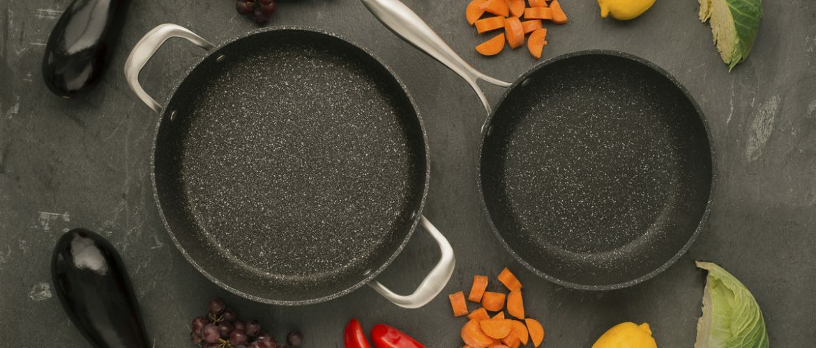
Shooting Amazon-ready Lifestyle Product Photography for World Kitchen Cookware.
We were recently commissioned by World Kitchen to capture their gorgeously crafted kitchenware in both lifestyle photography and white background cutout fashion. We’ll shine a light on the latter style in our next post, but today we’ll give a little insight into our lifestyle shoot and edit. If you read our blog, you’ll already know we’re big fans of lifestyle photography. We love art-direction, set dressing and executing concepts with a little creative flair and we’ve written numerous times about the proven benefits of lifestyle photography in endearing products to potential customers online. Cutouts are great, but barring the tactile experience you get with products in a shop, lifestyle photography is the closest you might get to really visualising a new purchase in context and convincing you to buy it. Case in point, this particular client commissioned us expressly to create images which would help market their range on e commerce behemoth Amazon, such are the potential rewards….. if you’ve not heard of Amazon, you need to check whether they deliver to that rock you’ve been living under!!
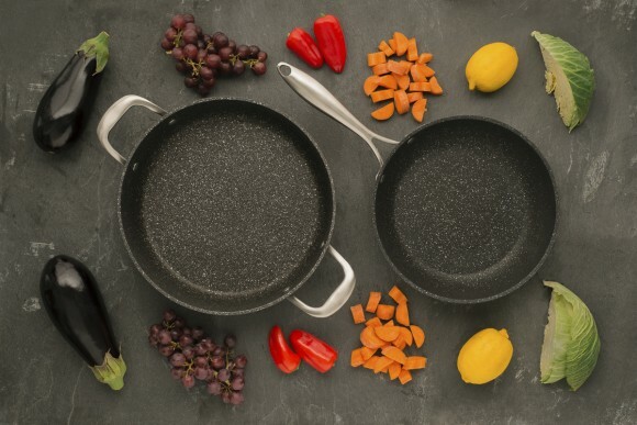
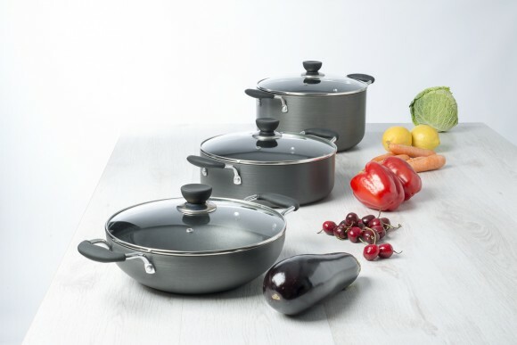
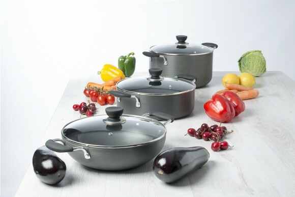
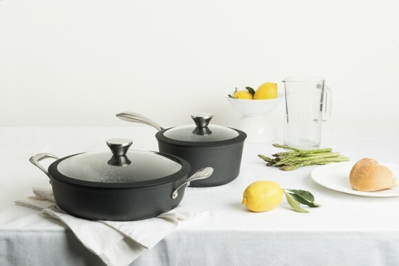
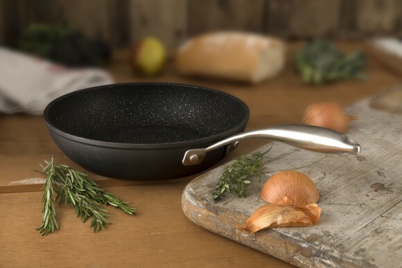
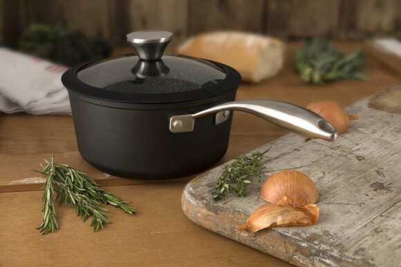
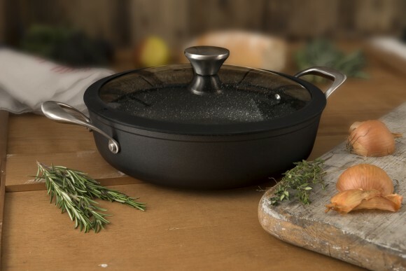
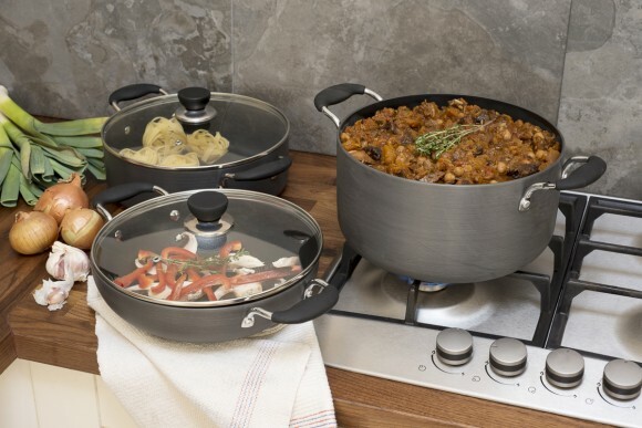
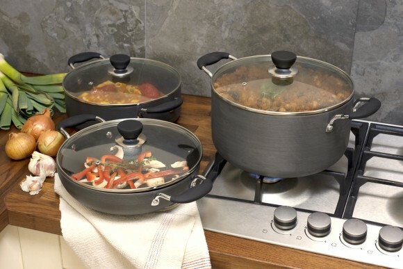
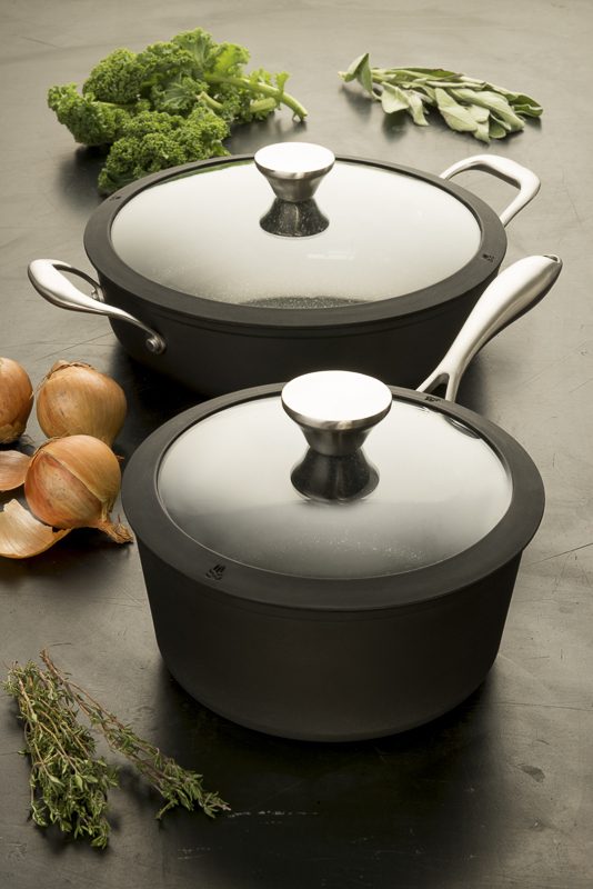
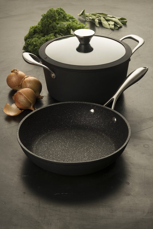
We wanted to get some shot variety to best show off the range so we snapped from multiple angles, including flat-lay. The graphic, considered nature of these shots gels well with the contemporary, precisely engineered products, and allowed us to inject some much-needed colour in a relevant, organic (in both senses) fashion.
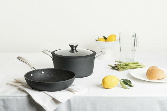
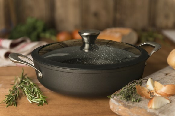
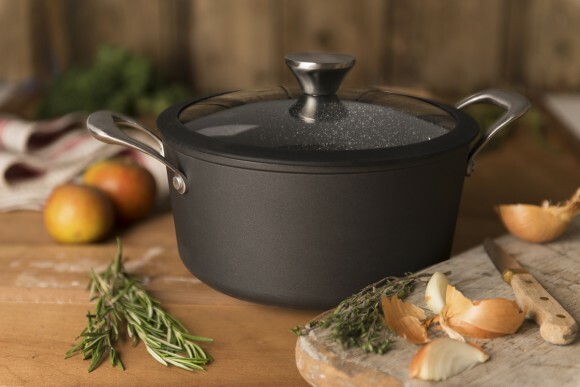
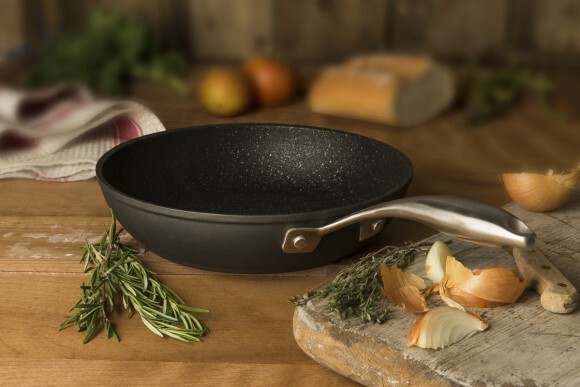
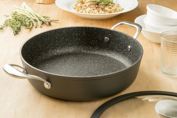
Lifestyle photography generally involves the use of “props” and in this case, those props were not just the surfaces on which we shot, but the fresh, appetising, healthy food we chose to complement our products. It’s not just a product, it’s a lifestyle you’re trying to market, so make sure it’s a desirable one! Injecting dashes of colour like this lifts what might otherwise be a drab shot, but shouldn’t distract from the obvious subject itself. In that sense, we had a further challenge on our hands. The client rightly wanted the images to clearly reveal the texture of the quality materials used, so we knew we needed sharp focus. We attained this though a combination of small aperture, image comping and blurring in post-production. Focus stacking allowed us to keep critical sharpness and depth when needed, as you can see below.
Small apertures necessitate longer exposures when using natural or continuous light, so a tripod (as ever with product photography!!) is a must. A tripod also allows you to tweak your scene or shoot multiple exposures for later comping without changing your overall composition. By shooting alternative, de-focussed exposures of each image and stacking them on the sharp shots, we were able to selectively blur our backgrounds and surrounding items using layer masks in photoshop, whilst retaining full detail on the products themselves.
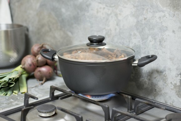
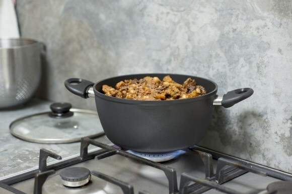
When shooting our on-hob images, we found the heat was causing condensation to form on the products, so once again, we used layer masks to combine two shots and avoid this.
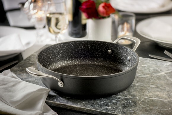
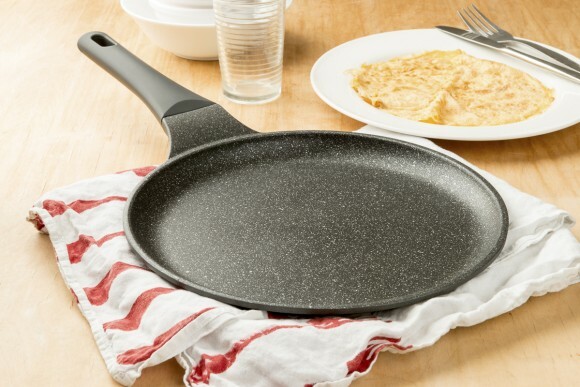
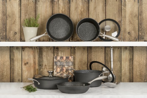
Ultimately, lifestyle photography is about suggesting attainable desirability and in this case, premium quality at reasonable prices. Everyday ingredients make the items relatable (who doesn’t want pancakes after looking at the shot below??!) whilst quality props, such as wood, marble and slate, roses and wine glasses lend an elevating air to proceedings. It’s not always necessary to scout real-world locations for shooting – the majority of these shots were attained in-studio, using prop materials we’ve accrued over years of product photography. Careful composition and cropping can turn a 1m X 1m slate board into the perceived counter-top of a vast, luxury kitchen. Even high-end shelves can be suggested with a couple of propped up marble boards in front of some wooden panelling. Did we reveal too much? Did it spoil the magic? Did we eat the pancakes?……..
…..of course we did.
Thanks for reading

Hello!
I have a product in the kitchen category that I sell on Amazon. I need lifestyle shots (in a kitchen).
What are your fees for 3 shots?