The importance of flat lay in commercial photography
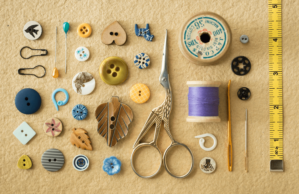
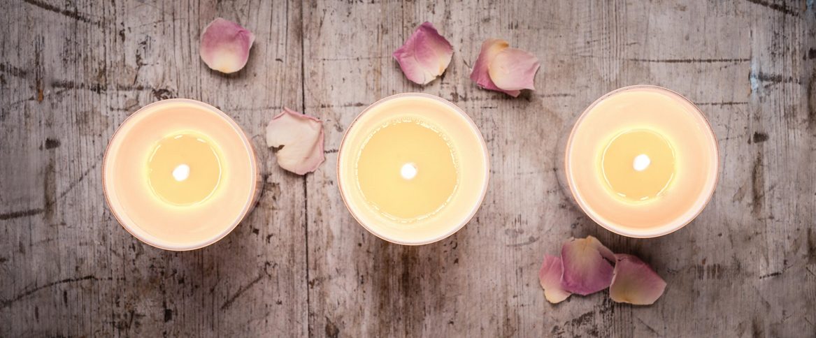
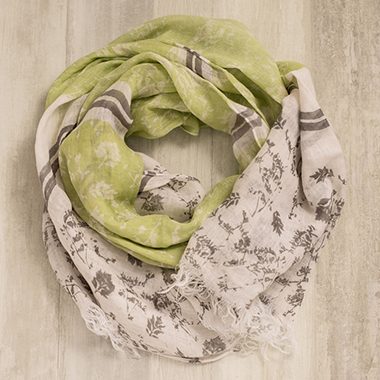
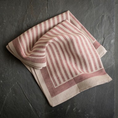
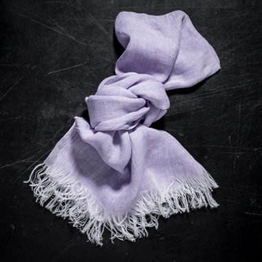
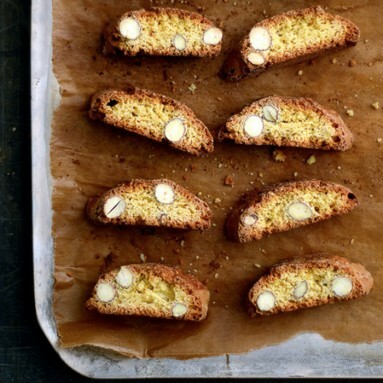
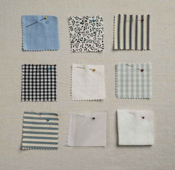
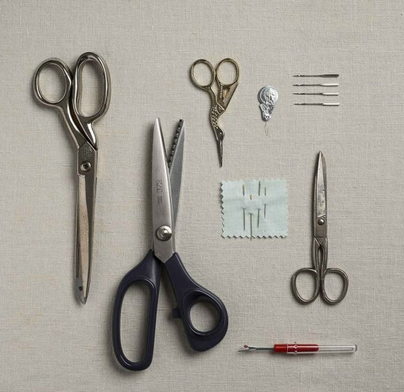
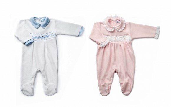
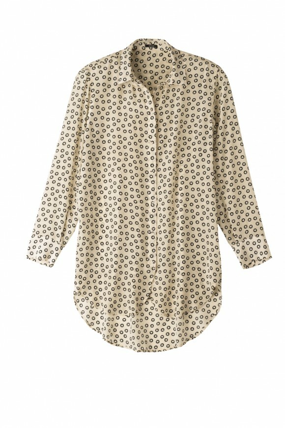
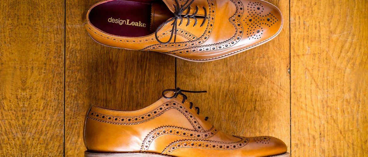
Flat lay has been all the rage on social media for some time now. You only need to search #flatlay on pinterest or instagram to yield tens of thousands of images. So, just what is a flat lay photography and why is it so popular? In simple terms it describes any photograph taken from above with objects laid on a surface – simplicity is a theme that is indicative of flat lay, along with a simple background, although this is by no means a hard and fast rule. Subject matter is limitless; food, beauty products, shoes, flowers and clothing all look good from above – it is a medium that has wholeheartedly been embraced by the fashion industry and bloggers alike – it’s a perfect way to show clothing and outfits. Bloggers frequently use the style to illustrate #ootd (outfit of the day) and retailers use it as an effective way to show single garments.
Much of its popularity has been attributed to it’s simplicity. Flat lay doesn’t detract from the product being shown nor does it put it in context as does a propped and styled image – that’s what makes it such a useful way to show product in a commercial environment. Advocates of flat lay all urge you to shoot a square image, and yes, this works wonderfully for lots of subjects, but let’s not limit ourselves to the square – web banners lend themselves perfectly. Fashion flat lay is a good alternative to invisible mannequins – shot from above with some thoughtfully placed padding to give a sense of depth – it can often be a cheaper but equally effective alternative.
So what are the key things to bear in mind when photographing flat lays?:
• Lighting – As with any photography, light is key and flat lay is no exception. Strong shadows or lifeless, dull light are going to ruin your image. If you don’t have access to professional lighting, stick with window light – a north facing window is perfect. Light should be consistent for most of the day and you will never run into problems with the sun streaming across your subject. A white reflector is good for softening shadows and black is great if you want to give your shadows a bit more punch.
• Format – Square is king on social media, but don’t limit yourself. Think panoramic, web banner, portrait, round; whatever works for your application.

